In the last couple of weeks, I have been working on and off on a PowerPoint presentation for a new course titled Introduction to Mandarin Chinese Pronunciation I plan to teach in Israel. As the name suggests, it is a beginners’ course, and it teaches the fundamental sounds of the languages such as tones, initials, vowels and so on.
Learning and mastering the sounds of any language is a repetitive task, which can easily become very boring for the student, no matter how interested they initially were. That is why I try to make this process as practical as possible and incorporate ultrabasic vocabulary and highly useful example words into the teaching materials.
Even though this is a pronunciation course which primarily focuses on sounds and phonetics, since I chose to include some vocabulary, I bare the responsibility to help the student absorb the sematic elements of each example. One of the best ways to do that is to add visuals, which is a good habit to have not only for teachers, but for anyone who makes presentations in general.
Microsoft 365 Creative Asset
I have been a happy Microsoft 365 subscriber for the last couple of years now, and with that I get access to a complete library of stock images, icons, illustrations, stickers and more. However, while I was looking for some graphics for this presentation, I started to notice some peculiar things in this section. Things that indicate the platform won’t be useful for me as a language teacher for very long.
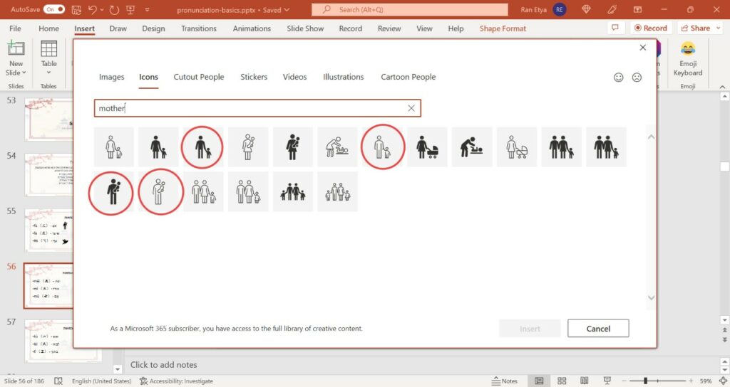
It started when I search for the term ‘mother’ in the icon section, to place it next to the example words mā (mom) and mǔ (mother) I teach under the sound of the letter M in Pinyin. Here is an image of the search results – I circled the four icons I thought it was rather odd to include there:
After that I search for the term ‘father’ in the icon section, because I also teach that word along with the word ‘dad’. Here are the results of that search – notice they are far less “inclusive”.
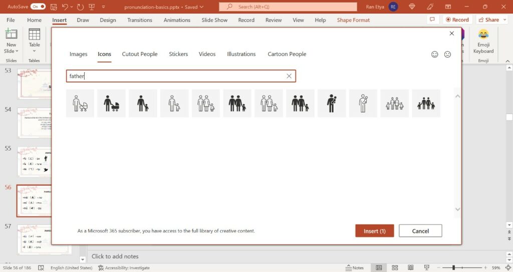
I find this really interesting. First of all, why expand one definition but not the other? Second, what will the person who is offended by the inherent association between motherhood and women do when they learn Chinese? Because the Chinese character for mom 妈 (mā) is based on the Woman Radical 女 which appears on its left side as a semantic component. Will the Chinese language be deemed offensive at some point? And how does that sit with the notion that gender roles are a mere construct of western colonialism?
In that presentation I also teach the Chinese character for man or male. This character is written 男 (nán) and it combines the Field Radical 田 (tián) with the Strength Radical 力 (lì). The idea here is that men are strong and work in the fields, though if you travelled in rural China, you would quickly find that this is no longer the case, and in many places it is women who labor tirelessly in the fields while the men stay at home, drink and play cards all day.
I have always thought the character 男 (man or male) looks like a man posing a basic boxing stance, with the 田 representing his face, and 力 looking like arms half raised and ready to protect it. I always give my students this helpful memory tip, and therefore I wanted to include it in the presentation. However, when I search the term ‘boxing’ in the Stock Images section, this is what I got:
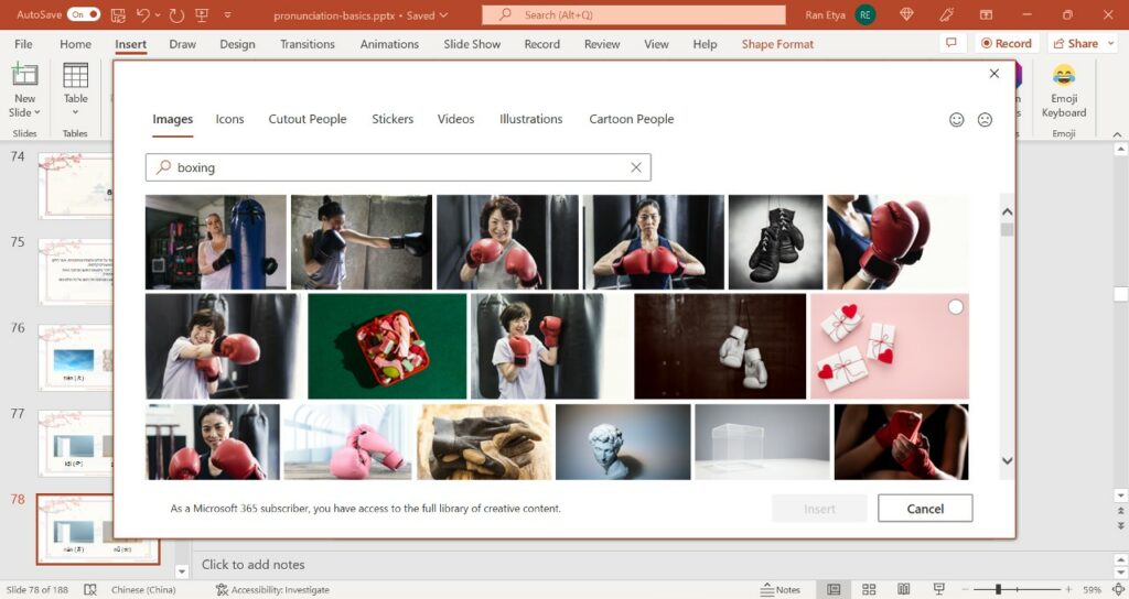
Notice the complete lack of men from the results? And in boxing nonetheless? 17 visible top images, nine of them with people, and not a single man. And the top result is of a plus-size woman who’s not even build like a typical boxer.
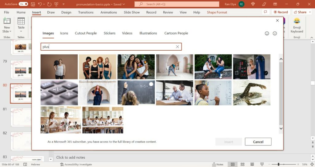
By the way, I am not the one saying this woman is plus size. I looked for the word ‘plus’ because I teach the Chinese word 加 (jiā) meaning add, and her image appeared there too.
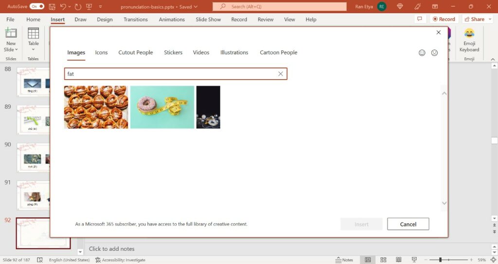
Speaking of plus size, in this course I also teach the words fat and thin. However, Microsoft 365 stock images were not of much use for me there. Here is what I got when I searched for the word ‘fat’:
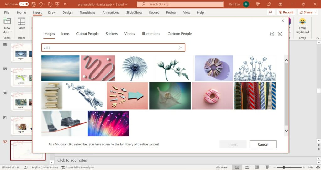
And here is what I got when I searched for the word thin in Microsoft 365 creative asset library – more results but still nothing close to what I needed as a visual aid.
Chinese to the rescue?
Disappointed, I turned to my go-to Chinese website for graphic assets. There I found exactly what I was looking for – both for under 胖 (fat – pàng) on the left and 瘦 (shòu – thin) on the right in the next image.
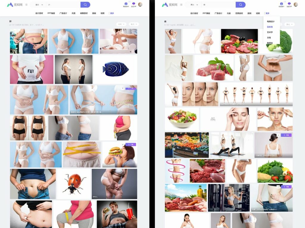
This is probably the first time an online search I made on Chinese website gave me more open and accurate results that correspond better to reality, than a similar search in a western counterpart. I don’t know about you, but I find it very ominous.
More Microsoft 365 Interesting Creative Choices
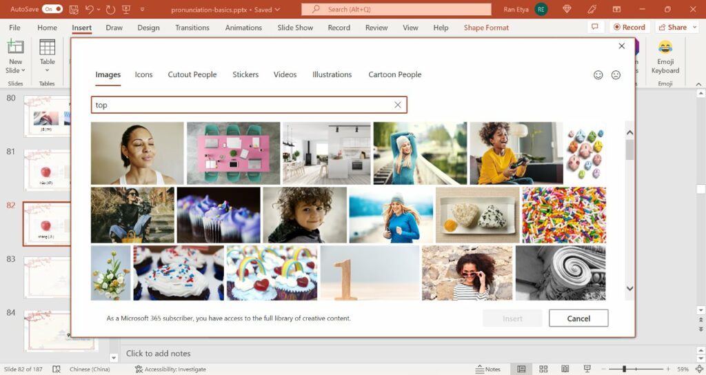
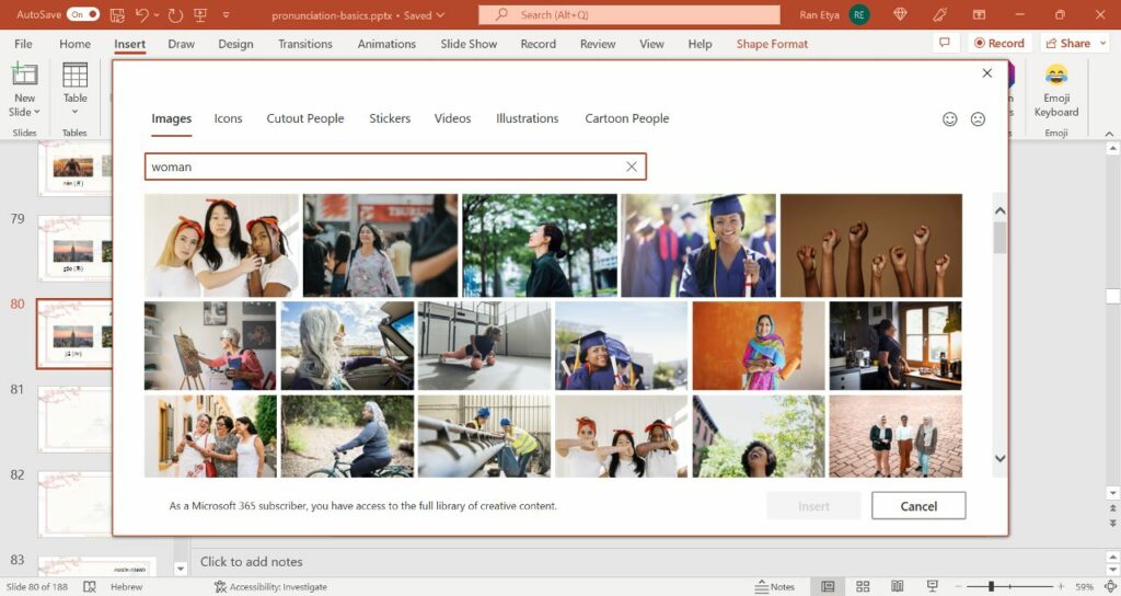
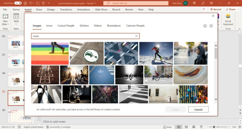
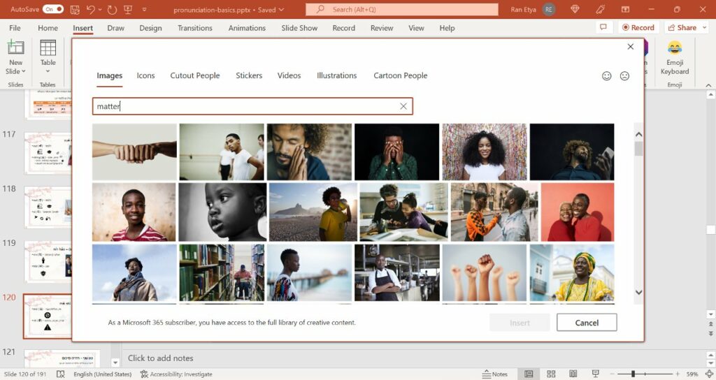
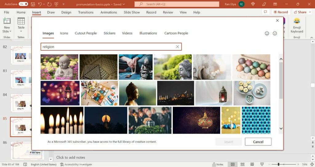
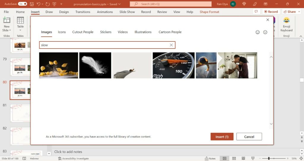
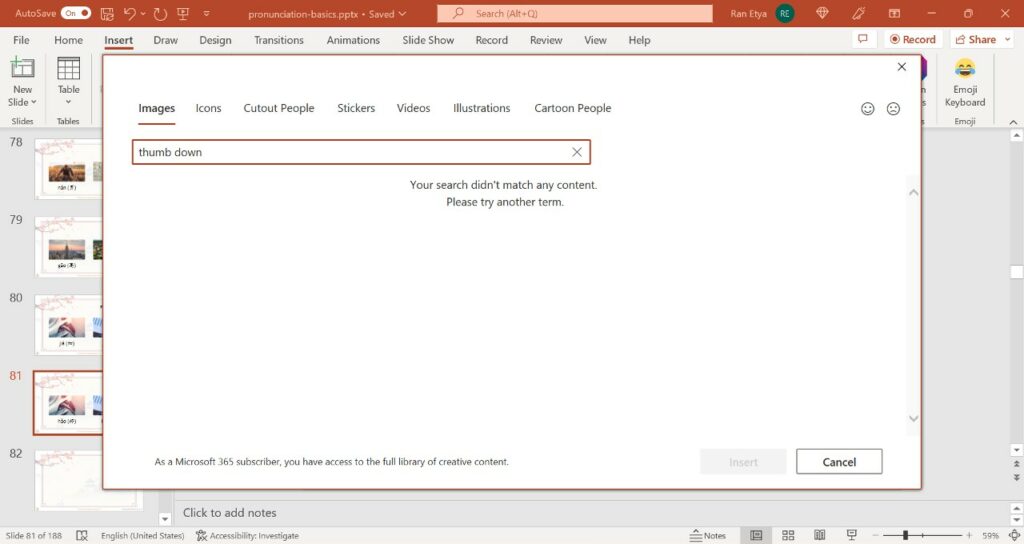
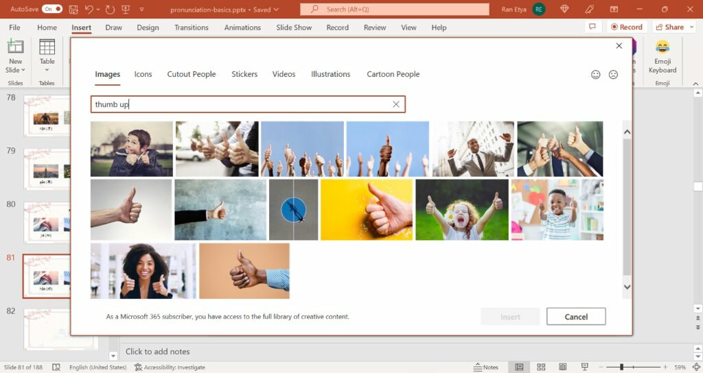
I will leave you with a couple of more search results from Microsoft 365 creative asset stock image that caught my attention while I was working on that presentation. Make of them what you will.
Stay in Touch!
Get the next post from Hebrew Monk directly to you inbox!
Don't like emails? Subscribe to Heberw Monk's Telegram Channel instead.

